
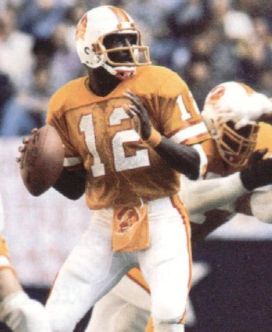
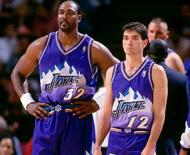
There have been many bad looking uniforms through the history of sport. Off the top of my head the Tampa Bay Bucs into the late 90s, the Houston Astros into the mid 90s, any of the NHL 3rd jerseys from the mid 90s and most of them today, the LA Kings before Gretzky got there, the Utah Jazz and the Houston Rockets of the late 90s, and the Denver Nuggets til the early 90s. But the worst region for ugly uniforms has to be the Pacific Northwest and Sunday's Seahawks/Bears game was a prime example. Dear lord. It looked like someone dropped a highlighter pen in the wash.
Lets stick with the Seahawks. Most NFL teams with third jerseys suck (and I don't mean throwbacks, I mean taking a secondary colour in the uniform and making it the primary colour in the 3rd jersey). Just look up the Texans, the Dolphins, the Broncos, and da Bears but Seattle took it to a whole new level. I understand teams wanting to make extra revenue by selling an extra jersey but those were just embarrassing to watch (and I fucking hate the Seahawks). The Rams and Niners sell gold jerseys and the Raiders sell silver ones but they don't make the players wear them (and more importantly make the fans watch them).
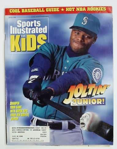
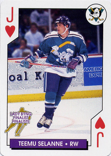
Ugly uniforms aren't new to the 'Hawks, I'm sure we all remember their expansion uni's they wore until the beginning of this decade and even the present ones kinda suck (I just really hate the neon green) and their neighbours and former roommates are no exception to this plague of bad taste. Comparatively, the Mariners haven't been as bad but that doesn't mean they've been that good. Just look at the pre-Griffey uniforms (OK, a lot of baseball teams looked bad in that era), the early Griffey years (is that sposda be a Superman font?), and the late Griffey era (why so much teal?!). They've been pretty good in the post and new Griffey era but that can always change.
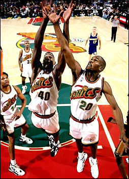
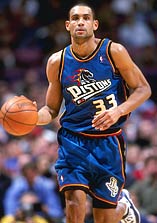
Also in Seattle (well, not anymore) the Sonics were not immune to poor fashion choices especially in the mid to late 90s where a lot of NBA teams for better or worse revamped the uni's. As mentioned earlier, the Rockets and the Jazz but lets not forget the Pistons, the Cavs, the Hawks, and the Warriors. I never understood why Seattle had to change from the old ones to those ones, but at least they got it right before they left... OK, maybe not the third jersey.
Further down the I-5 brings us to Portland where aside from who they picked second overall in the 1984 Draft to wear the uniform, it's always looked good. Can't say the same for their University.
Going north to the city I call home is also home to some of the worst uni's ever! Let's start with the Leo's who aside from having orange as either a primary or secondary colour throughout their history have made it work with the glaring exception of the alternates they've worn for the last couple seasons until this one (it may come back next year). The jerseys are fine (aside from ripping off the Falcons) but why the orange helmets?!
Across the street to GM Place we have the former home of the Grizzlies who couldn't get it right in their first or second try but you know what they say, third times a chram... too bad they were in Memphis by then.
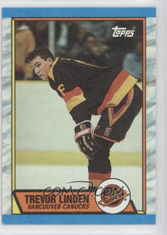
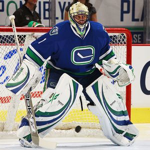
And this brings us to the Grizz's former roommates who just can't get it right and when they do, they change it. The Canucks began with the "stick n' rink" sweaters which were pretty good with the exception of the "V" on the arms but they fixed that a couple years later. But before the decade ended came quite possible the ugliest primary jerseys ever worn in North American pro sports. The "Flying V" jerseys lasted about a decade then the "plate of spaghetti" was moved to the front and the "V" was mas moved to the shoulder before being scrapped all together. In the mid 90s came the red 3rd jersey which were awful but considering the the Kings', the Ducks', the Bolts', and the Blues' 3rd jerseys (which St. Louis didn't even wear cause they were so ugly) the 'Nucks got off easy. In the late 90s came another change because let's face it, everyone in Vancouver has good feelings about the Linden/Bure era jerseys but they sucked. In came the "crapping whale" (and I don't mean Messier... well, kinda) and it sucked more. They added a 3rd jersey with red shoulders and it sucked even more. Then came the throwback "stick n' rinks" that everyone loved. They were used until Reebok (or RBK at the time) got the NHL jersey contract and wanted to revamp the cut and material of all the uni's and also gave the teams the option of redesigning the jerseys if they wanted. I remember the buzz in the city with everyone wondering what they'd go with cause surely the "crapping orca" has to be gone. Would they make the the "stick n' rinks" stay? Would they go back to their WHL roots and bring back Johnny Canuck? Would they go back even further and bring back the Millionaires jerseys? Would we see the return of the "plate of spaghetti" that is so ugly but everyone is so fond of? Would we see something new? And what did we get? A whole lotta crap. Now they did redeem themselves the next year with the new 3rd jersey and the rumor is that when the Olympics are done the "Vancouver" and the "crapping whale" are gone but they've screwed this up before. After all this is the Pacific Northwest.
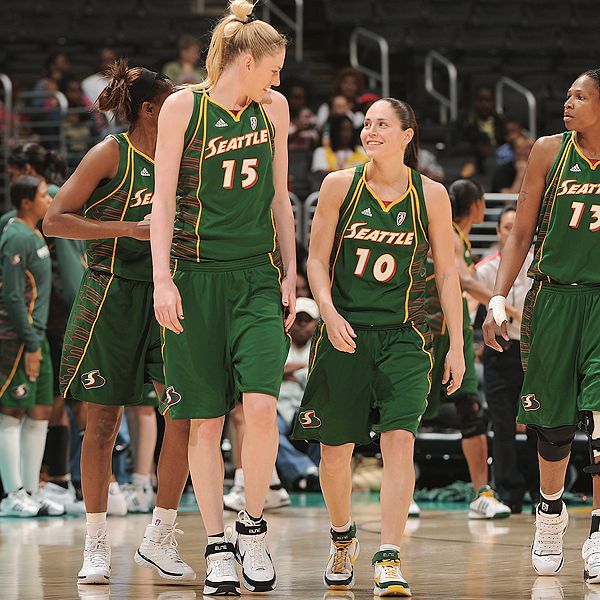
(Honorable mention to the Seattle Sounders and the Seattle Storm)

No comments:
Post a Comment